Visual Merchandising: Examine Six Basic Principles of Display
Visual Merchandising
Examine Six Basic Principles of Display (Section 4, Part 1)
Visual merchandising, especially display, is one of the most creative, exciting, exhilarating, and fun responsibilities of the Sales Promotion Division. Yet, at times it can be very frustrating, most difficult, and laborious work. Like other careers in the marketing field, the visual merchandiser’s job is never done and sometimes the time spent on the work is not evident to the target consumer. However, it is very rewarding for the visual merchandiser to see all of the products in a display sell out completely or to observe the consumer enjoying the presentation.
Plan the Merchandise Presentation & Displays
Visual merchandising personnel must develop a plan for each merchandise presentation. Initially, an overall strategy that defines the Who, Why, What, Where, and When of a merchandise presentation must be established. Additionally, there must be a timetable, organizational chart, and sketch to scale for each major display event.

Select Merchandise Thoughtfully
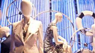
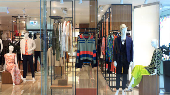
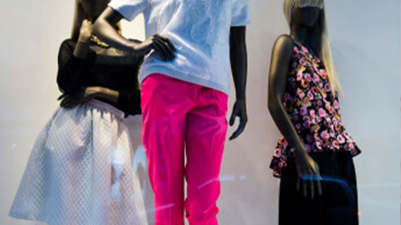
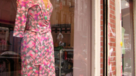
When building the actual display, the first step the visual merchandiser takes is that of analyzing and selecting the merchandise to be displayed. It is of utmost importance that display personnel recognize that the merchandise to be displayed is the focus of the artistic endeavor and that all other elements needed to build the display play a supporting role to the merchandise itself.

Select Color & Texture First, Then Define Line
Although reaction to color is a personal, individual, private experience that is influenced by culture, regional and global locations, and environmental background, the consumer is instinctively impacted by colors with which they are confronted every day in their environment. For example, blue reminds the adult consumer of the ocean or water and the sky. It is a universal color that is calming and restful. In fact, it is a color that is selected by both men and women as a favorite.

Maintain Good Composition
The fourth principle is Maintain Good Composition.
When creating the design of each display, the composition or the use of the art elements (i.e., color, texture, proportion, line, and shape) and design principles (i.e., composition, balance, rhythm, repetition, and dominance) along with the theme, props, attention-getting devices, and signage must be planned in detail. The impact of the design principles, attention-getting devices, and signage are explained in this part.
Plan Lighting Techniques
Light is composed of waves of radiant energy that are either reflected or absorbed. When light is absorbed, the color of an article or item is seen. In other words, there must be light for color to be seen.
The primary light colors are red, green, and blue. (Note that the yellow pigment is not a primary light color!) As with mixing primary pigments to create other colors, the primary light colors can be mixed to form the secondary light colors of magenta (i.e., purplish-red), amber (i.e., brownish gold-like yellow), and cyan (i.e., blue-green). These colors can provide interesting effects on both positive elements and negative spaces.
Evaluate Effectiveness of Presentations
Maintaining good composition in an artistic endeavor is critical to creating unity and harmony in the display. In order to communicate a well-planned message and direct the consumer’s eye to all the elements of the display, the visual merchandiser must carefully plan the type of balance and the dominant item or focal point of the display, along with the mechanisms for creating rhythm.
- Does the type of balance support the theme and merchandise classifications in the display?
- Is the focal point evident?
- Are there items, such as props and attention-getting devices, which direct the viewer’s eye from the dominant area to all other areas of the presentation?
- Are there odd numbers of items utilized to create interest and provide rhythm in the composition?
- Are all components in proportion to the whole as well as to each other component in the display?
A creative endeavor can be planned and assembled perfectly. However, if the proportions of the components are not compatible, the viewer senses the instability of the composition.